Progress Visualization Charts
Numbers in a table tell you what happened. A line on a chart shows you where you're going. Plot your data, connect the dots, and watch your trend emerge over time.
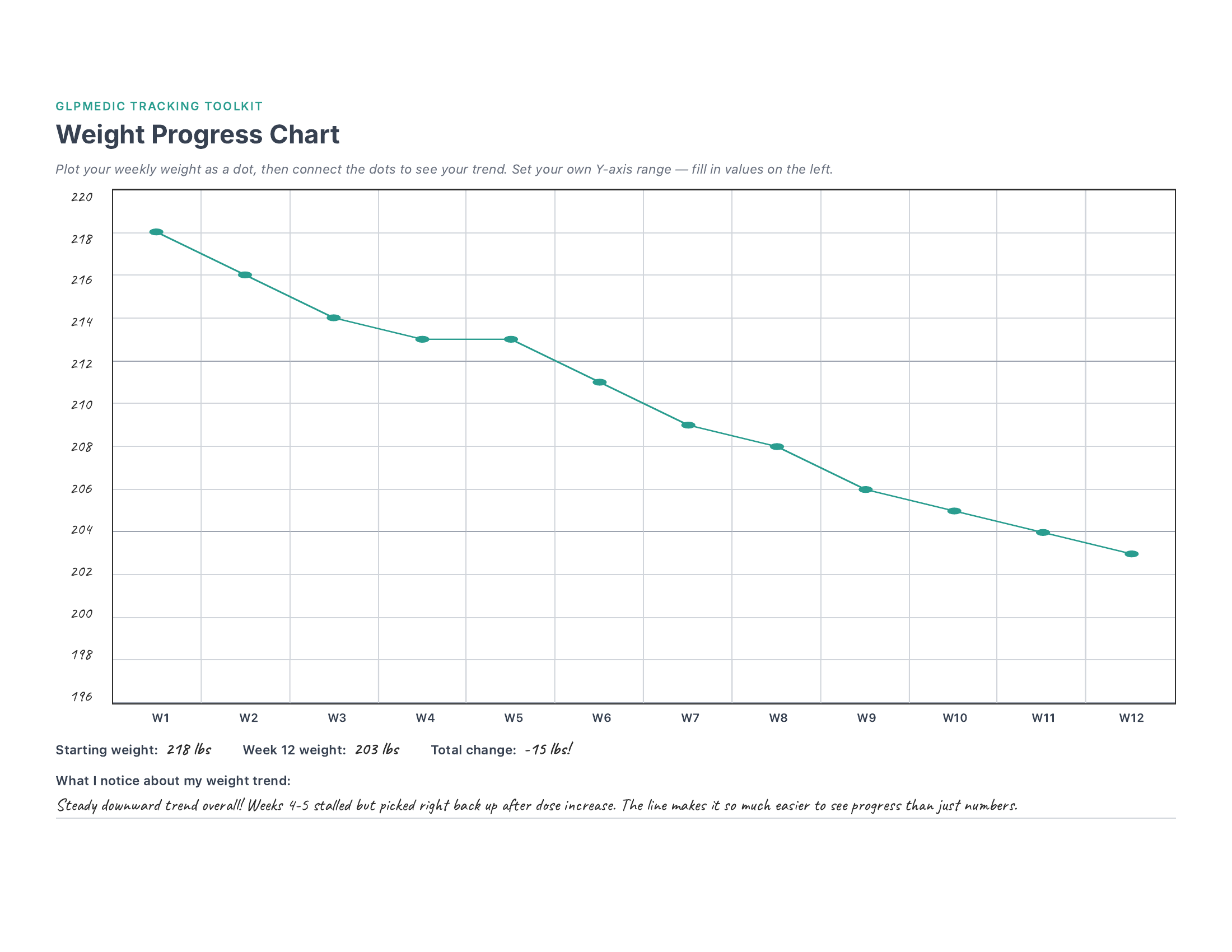
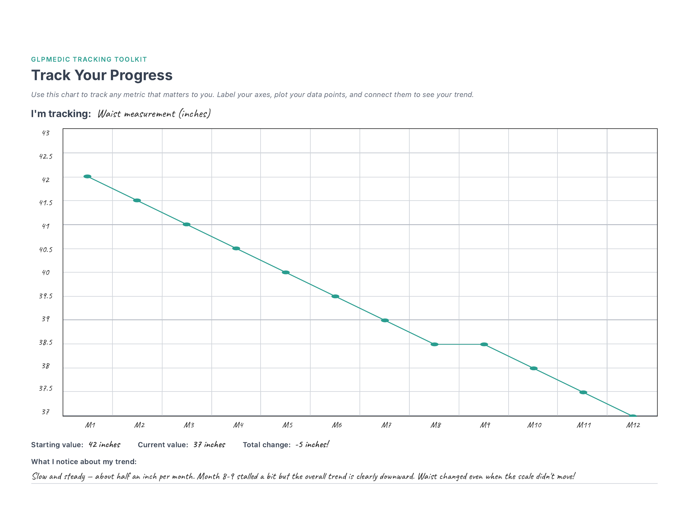
See it in action — page 1 shows a realistic 12-week weight trend with a stall at weeks 4-5 that's barely visible in the bigger picture. Page 2 shows the same chart customized for waist measurement over 12 months.
What's Included
Weight Progress Chart
A dedicated 12-week chart with weeks pre-labeled on the X-axis. Set your own weight range on the Y-axis, plot weekly, and watch the trend line form.
Track Any Metric
A fully customizable blank chart — label both axes yourself, track whatever matters to you. Waist, energy, blood pressure, steps — your call.
Trend Summary
Below each chart: starting value, ending value, and total change. Quick fields that capture the headline numbers from your trend.
Reflection Prompts
Space to write what you notice about your trends. This is where the real insight happens — patterns that are invisible day-to-day become obvious on a chart.
There's something genuinely different about seeing your weight drawn as a line across 12 weeks versus reading a column of numbers. I hit a two-week stall around week 4 that felt like the medication had stopped working. But when I looked at the chart? It was a tiny flat spot in an otherwise clear downward trend. That perspective kept me from making a frustrated call to my doctor about a problem that didn't actually exist. The chart doesn't lie — even when your brain wants to.
How to Set Up Your Chart
- 1 Print in landscape and 3-hole punch for your binder. Each chart is a full page — plenty of room to work with.
- 2 Set up your Y-axis range. Pick a number about 5-10 above your current weight for the top label, and your goal weight (or below) for the bottom. Space labels evenly — for example, every 2 lbs if your range is about 25 lbs.
- 3 Each week, plot a dot. Find your weight on the Y-axis and mark a dot above that week's column. Don't stress about being pixel-perfect — close enough works great.
- 4 Connect the dots. Draw a line from each dot to the next. This is your trend line — the whole point of the chart. Even two or three weeks of data starts to tell a story.
- 5 After 12 weeks, fill in the summary. Write your starting weight, ending weight, and total change. Then take a moment to write what you notice — the reflection is where the insight lives.
Ideas for Your "Track Anything" Chart
The second page is completely blank — both axes, all labels, yours to customize. Here are some ideas for what to track:
This chart can track literally anything with a number. And since it's a printable template, you can print as many copies as you want — one for weight, one for waist, one for blood pressure, one for energy. Build your own dashboard.
Get the Full Tracking Toolkit
This template is just one of 23. The full bundle gives you everything you need to track your entire GLP-1 journey.
Daily & Weekly
- Daily Check-In
- Weekly View
- Weekly Reflection
- Habit Streaks
Health Monitoring
- Side Effects
- Injection Sites
- Body Measurements
- Blood Work
- Sleep
Progress & Milestones
- 8-Week Tracker
- 12-Week Dashboard
- Progress Charts
- NSV Tracker
- Clothing Timeline
Nutrition & Lifestyle
- Protein Tracker
- Meal Planning
- Food Diary
- Exercise Log
- Hydration
Planning & Reference
- Appointment Prep
- Medication Supply
- Cost Tracker
- Support Network
Bonus
- Free access to every future template — as the toolkit grows, so does your bundle. No extra cost, ever.
- Request custom templates — need something specific? Reach out to Brandon and he'll build it for you.